
all projects start with a need
-
not the same thanksgiving
how can we make thanksgiving feel fresh but still stay on target so people understand it’s thanksgiving? (hint: color helps)
-
testing
we wanted to use this opportunity to test branding vs no branding, colors, styles, so we could use that information to inform holiday graphics.
-
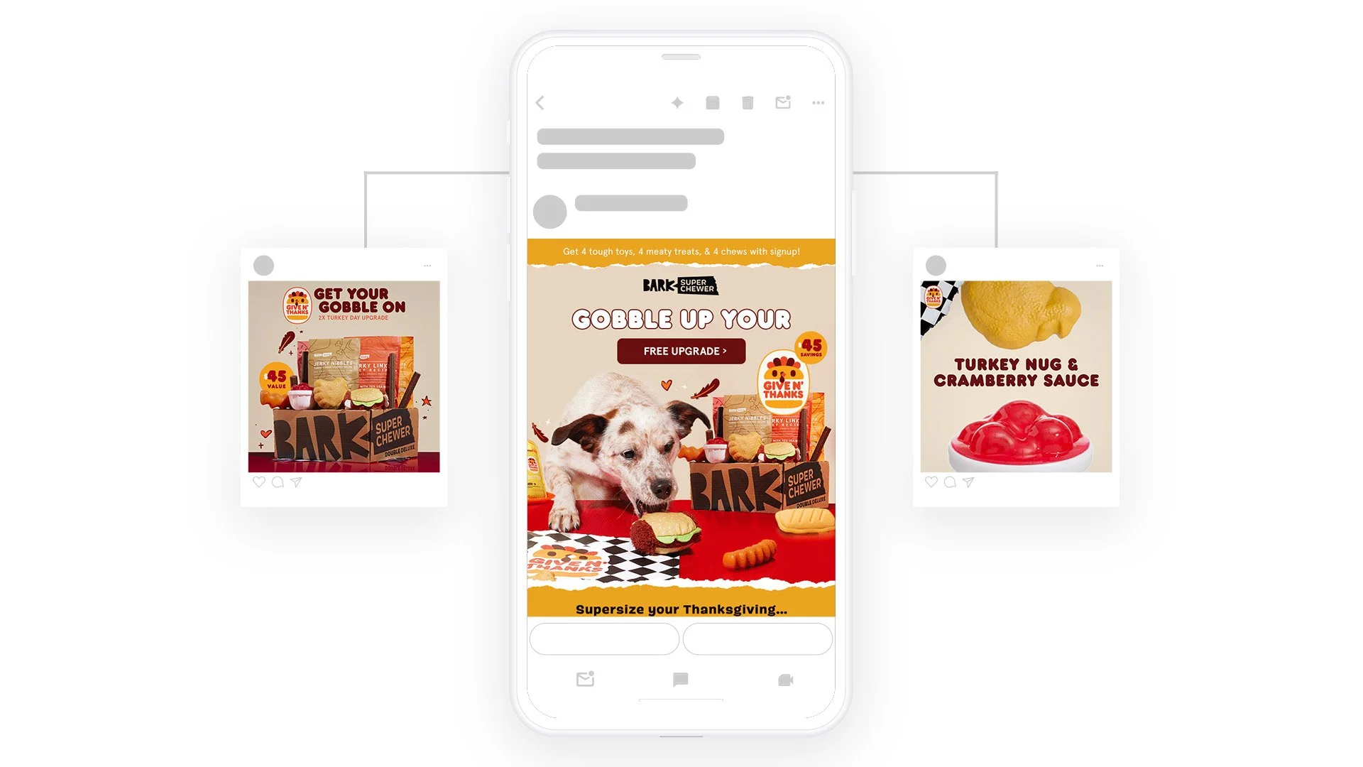
one shoot. 8 campaigns.
how can we reuse the same assets and make them feel fresh over multiple campaigns.


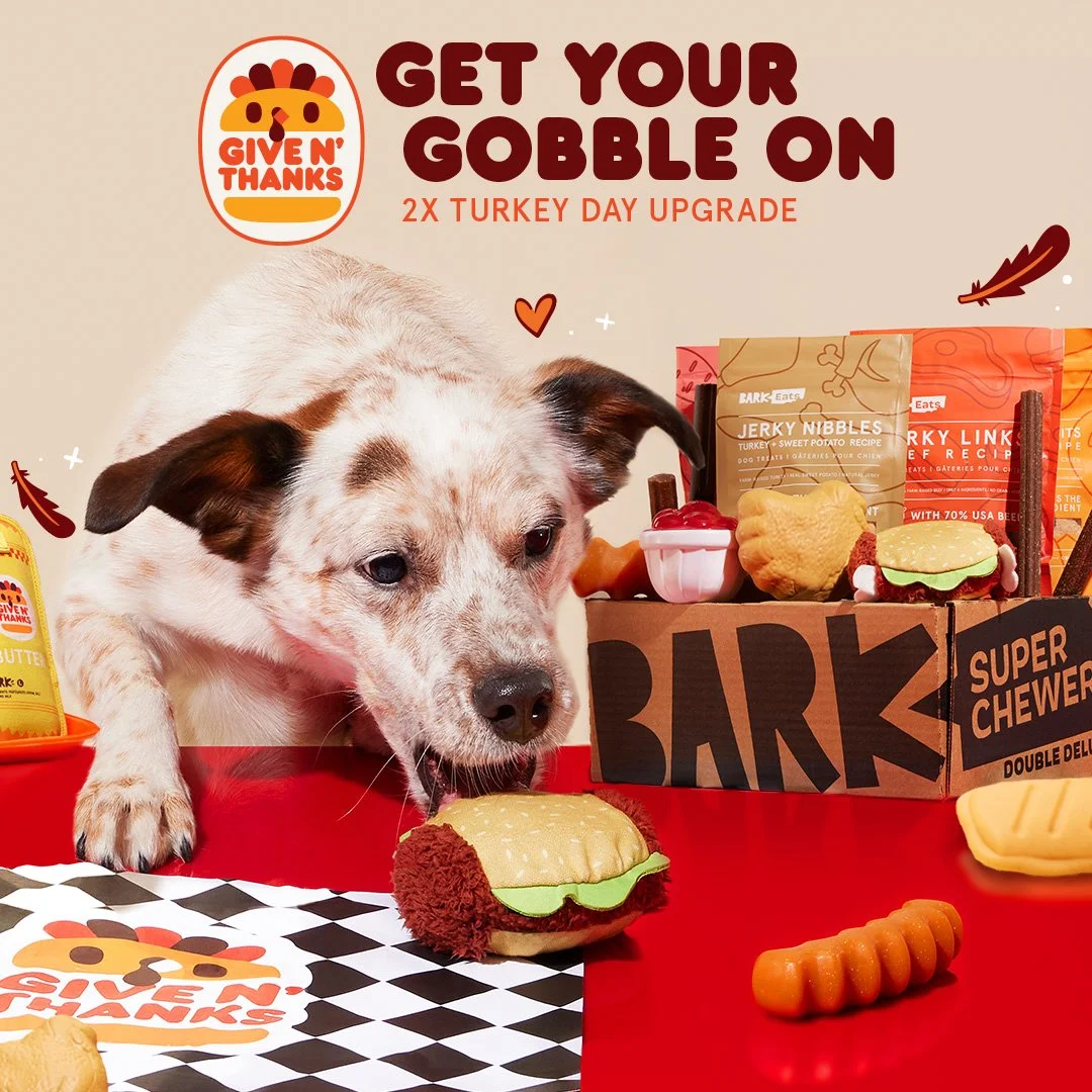
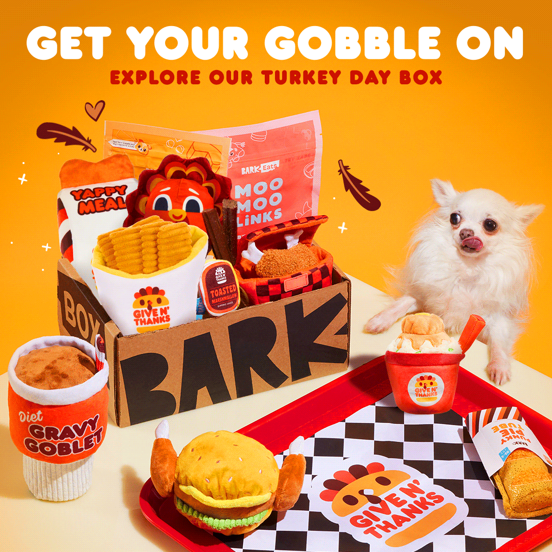
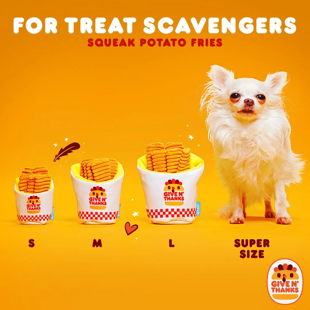
fast food thanksgiving
wanted to create a theme around fast food using thanksgiving themed toys for both brands.
we set up a seamless with colors indicative of a famous burger company that has a king but also felt very thanksgiving specific.


so. many. campaigns.
so little time. we wanted to be able to use assets across any campaign
that may be needed as we may or may not have had a marketing plan finalized at the time.
these assets have to work stretch from social media to email to web.

testing testing testing
lots of performance marketing was experimented with this time around.

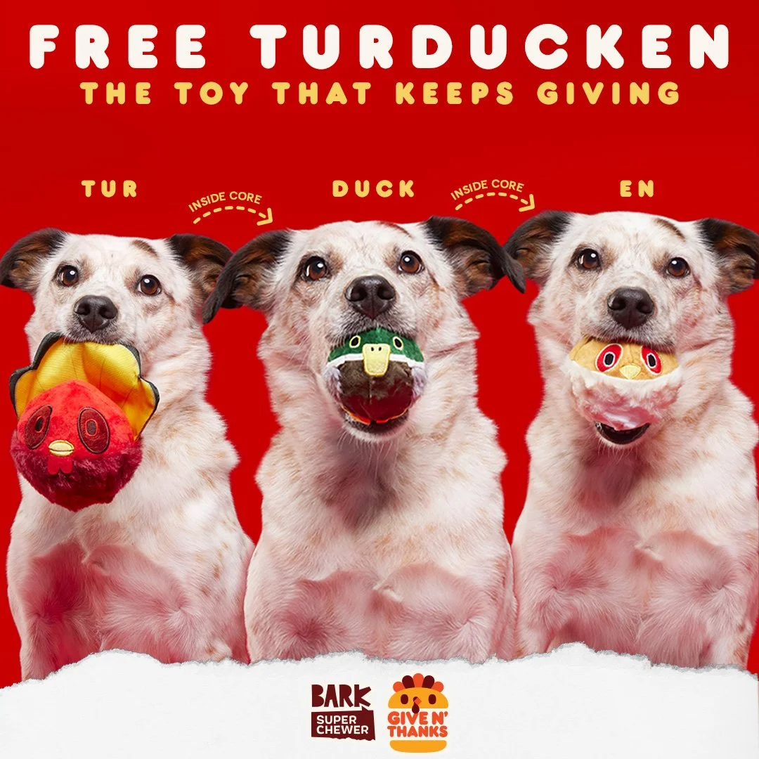
labeled playstyles

no branding
motion (highest)
unnamed burger chain -copycat graphic
calling out playstyle (highest)
patterned graphic
getting crafty
i had a vision of the toy shooting of the box, like the unnamed burger chain has graphics with slow mo’s of the food falling into frame.
we discussed so many ways to do it, but with no money and no time. we got crafty to create this graphic. below is how. indrucing the nerf gun.
skip to 21s
more from the shoot


Credits
In-House Team: Bark
Creative Director: Woodie Moon
Art Director: Myself
Designers: Danny Yu
Photography Team: Steven Zeswitz / John Keon